
Is a picture worth 1,000 words if patients don’t understand it?
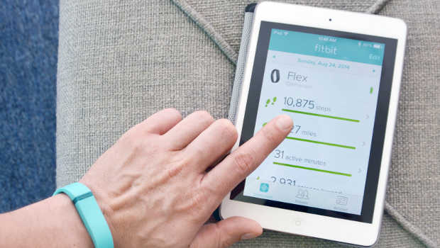
Graphic data displays, like on a Fitbit app, are meant to motivate patients to change behavior and understand their care. But do they work?
Visual displays of health data are everywhere you look. People walk around wearing health and fitness devices like Apple Watches and Fitbits. Care providers use graphs and charts to help patients with medical decision-making. There are even ingestible microchipped tablets that patients can view for personal medication management via their smartphone app! But an estimated nine in ten Americans have limited health literacy, so it is not clear how—or if—the public understands these visual displays.
To explore this question, Jasmir Nayak, MD, of the University of Washington (UW), GHRI Assistant Investigator Andrea Hartzler, PhD, and colleagues tested literacy skillsets in a cohort of patients using charts and graphs that displayed trends in health-related quality of life following prostate cancer treatment. First, they assessed the patients’ health literacy, numeracy, and graph literacy. Then they assessed how well the patients understood tables, line graphs, and bar charts, and asked which ones they preferred.
Even highly educated patients may misread graphs and charts
Despite high health literacy in these educated patients (78 percent were college educated), the ability to comprehend graphs varied. Interestingly, although most patients (46 percent) preferred bar graphs, and those with low numeracy preferred them even more (79 percent), comprehension was not significantly higher for this format. And a higher proportion of non-white participants were in the groups with low numeracy and low graph comprehension.
"A graph is not a picture."
A picture may be worth a 1,000 words, but, as the researchers point out, a graph is not a picture. Rather, it is “an amalgamation of information that requires multiple levels of processing to fully comprehend” and “involves multiple, increasingly complex abilities that correspond to fundamental domains” of graph literacy.
It may seem that charts and graphs should be easier to understand than tables full of numbers. But it’s ideal to first test how patients understand various ways of presenting data. The take-home message from this research is that clinicians should be careful not to assume that all patients readily comprehend and prefer graphically represented data—even highly educated patients. For researchers, the challenge remains how to match patients’ literacy abilities with the appropriate tools to truly engage them in patient-centered communication.
Drs. Nayak and Hartzler published their findings with UW coauthors Liam C. Macleod, MD, Bruce M. Dalkin, MD, and John L. Gore, MD; and Jason P. Izard, MD, of Queen’s University in Kingston, Canada, in Patient Education and Counseling: Relevance of graph literacy in the development of patient-centered communication tools.
By Casey Luce, MSPH
Casey Luce is a project manager at Group Health Research Institute


Land Acknowledgment
Our Seattle offices sit on the occupied land of the Duwamish and by the shared waters of the Coast Salish people, who have been here thousands of years and remain. Learn about practicing land acknowledgment.